Color Psychology in Modern Web UI: How Chromatic Harmony Dictates Micro-Conversions
A deep dive into visual hierarchy, button color contrast ratios, and how subtle gradient lighting shapes subconscious purchasing impulses.

Color choice in web design is never purely aesthetic; it is an ergonomic and behavioral navigational guide. A misplaced call-to-action color can confuse user focus and depress conversions by double digits.
The Isolation Effect (Von Restorff Effect)
When multiple similar items are present, the item that differs from the rest in luminance or chromatic intensity is the one most likely to be remembered and clicked.
"Your primary CTA should be the single most luminous element on the viewport at any given second."
Why Gradients Feel Dynamic & Contemporary
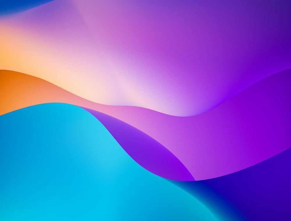
Flat colors feel static. Gradients mimic the natural play of light across physical curved surfaces, subconsciously communicating movement, depth, and sophistication.
- Reserve your primary gradient exclusively for high-intent conversion actions.
- Ensure WCAG AA contrast compliance across all text labels.
- Use dark contrast sections strategically to reset reader fatigue.
Written by Aryan Mehta
Director of Strategy at Amazing Go